Young adults who drive and experience car breakdowns need accessible, stress-free solutions for
repairs and assistance because existing tools are inefficient, leading to negative emotional and
practical experiences.
Duration3 months
RoleResearcher & Designer
Team4 members
ToolsFigma, FigJam
My Contributions: While I contributed across all project phases including
research, ideation, and prototyping, I primarily led the visual design direction. I
established the minimalist "frosted glass" AR interface aesthetic that enhanced real-world
visibility while maintaining a modern look. I developed the consistent typography system and
refined the limited color palette that became central to the application's identity.
Understand user challenges during car breakdowns to design a solution that meets their practical
and emotional needs.
Methodology
Type: Contextual interviews with 8 young adult participants who have
experienced a car breakdown while driving.
Focus Areas: Emotional responses, knowledge gaps, tool usage, and
interaction with roadside services.
Key Findings
Each team member conducted two user interviews and gathered key insights, which were then
collated onto a spreadsheet. These insights were further categorized into individual affinity
diagrams. Our team then analyzed these diagrams to identify common trends and insights from all
interviews.
After breakdown effects.Breakdown details.Breakdown environment.How the issue was resolved.Tools the user interacts with.User knowledge.
Tools and Interactions
Our research revealed significant challenges with existing roadside
assistance tools:
Existing apps (AAA, Honda, BMW) provide imprecise location tracking.
Wait time estimates are consistently inaccurate.
Car diagnostic tools and online search resources lack comprehensive information.
"There is no exact location on the AAA app"
Design Insight: Users need more intuitive, precise tracking and support
tools during breakdowns. The current ecosystem leaves users frustrated and confused.
Knowledge Gaps
Participants demonstrated limited understanding of vehicle mechanics and
emergency procedures:
Minimal basic car knowledge.
Uncertainty whom to contact during emergencies.
Lack of accessible learning resources.
"I do not know what my insurance company is"
"I am overwhelmed when I need to call a service and don't know who to call"
Design Insight: There's a critical need for accessible, user-friendly car
maintenance education that demystifies automotive knowledge.
Psychological Impact
Car breakdowns create lasting psychological effects:
Increased situational awareness while driving.
Heightened anxiety about potential future breakdowns.
Motivation to learn and improve car-related skills.
"I pay attention more at intersections now"
"I feel more acutely aware of gas levels and the lack of a spare"
Design Insight: Solutions must address both practical and emotional needs,
providing reassurance and empowerment during stressful breakdown scenarios.
Based on our insights, we created a persona to help identify and understand the users that we were
designing for.
Primary Persona: Carrol Kris
"I want to feel more confident handling car problems on my own, but I need
to know there's reliable help available if I get stuck."
Background
Age: 22 years old.
Occupation: Graduate student at Cornell University.
Location: Ithaca, NY.
Driving Experience: 1 year.
Goals
Build confidence in handling car-related issues independently.
Learn basic car maintenance to prevent future problems.
Find reliable assistance when self-repair isn't possible.
Minimize stress during car emergencies.
Pain Points
Feels overwhelmed by car terminology and mechanics.
Anxious about making wrong decisions during emergencies.
Limited knowledge of when to attempt repairs vs. seek professional help.
Struggles to find trustworthy mechanics in unfamiliar areas.
Behaviors & Attitudes
Tech-savvy and comfortable using mobile apps.
Prefers visual instructions over text-only guides.
Values independence but appreciates expert guidance.
Budget-conscious but willing to pay for reliable service.
Solution Space
Current Landscape
Digital vs. Physical Solutions
Current solutions offer partial assistance but fall short of comprehensive support. We
analyzed both digital and physical tools available to users:
Digital Tools: Informative and diagnostic, but lack actual repair
capabilities.
Breakdown Diagnostic Solutions: Solutions that enable users to diagnose car
issues, providing essential information about vehicle health and repairs. (OBD
Auto Doctor, OnStar, CarMD).
Connectivity Solutions: Solutions that connect users with nearby mechanics or
aid so users can get their cars fixed. (Mach1).
Informative Solutions: Solutions that give users information about services and
tools that can help them get their car fixed after a breakdown. (Google, Waze,
Repair Pal).
Physical Solutions: Quick access but limited in functionality.
Repairing Solutions: Solutions that are actually used to fix a car after it has
broken down. (Flat tire repair kit).
Connectivity Solutions: Solutions that connect users with nearby mechanics or
aid so users can get their cars fixed. (Repair beacon, assistance phone number,
road flare).
Working Elements:
Quick access to contact assistance.
Diagnostic support and maintenance tracking.
Finding and comparing available mechanics.
Key Missing Elements:
User education.
Emotional support.
Rapid, reliable problem resolution.
Design Selection Process
Using the data collected from research, each team member brainstormed 20 ideas based on the
problem statement and the persona's goal.
Our team then collaborated using a FigJam board, clustering these design ideas around key
insights:
Connecting users to repair resources.
Enabling self-repair information.
Diagnostic problem-solving.
Direct repair assistance.
FigJam board including all 80 of our ideation sketches.
Task Analysis
In addition to our ideation sketches, we wanted to include the key goals which our target driver
would follow when using a solution.
Based on our persona's goals, we identified four key tasks that the application needs to
support:
1
Becoming familiar with car mechanics.
2
Connect user with roadside assistance.
3
Guide the user through steps to fixing car.
4
Provide guidance to purchasing necessary parts and tools.
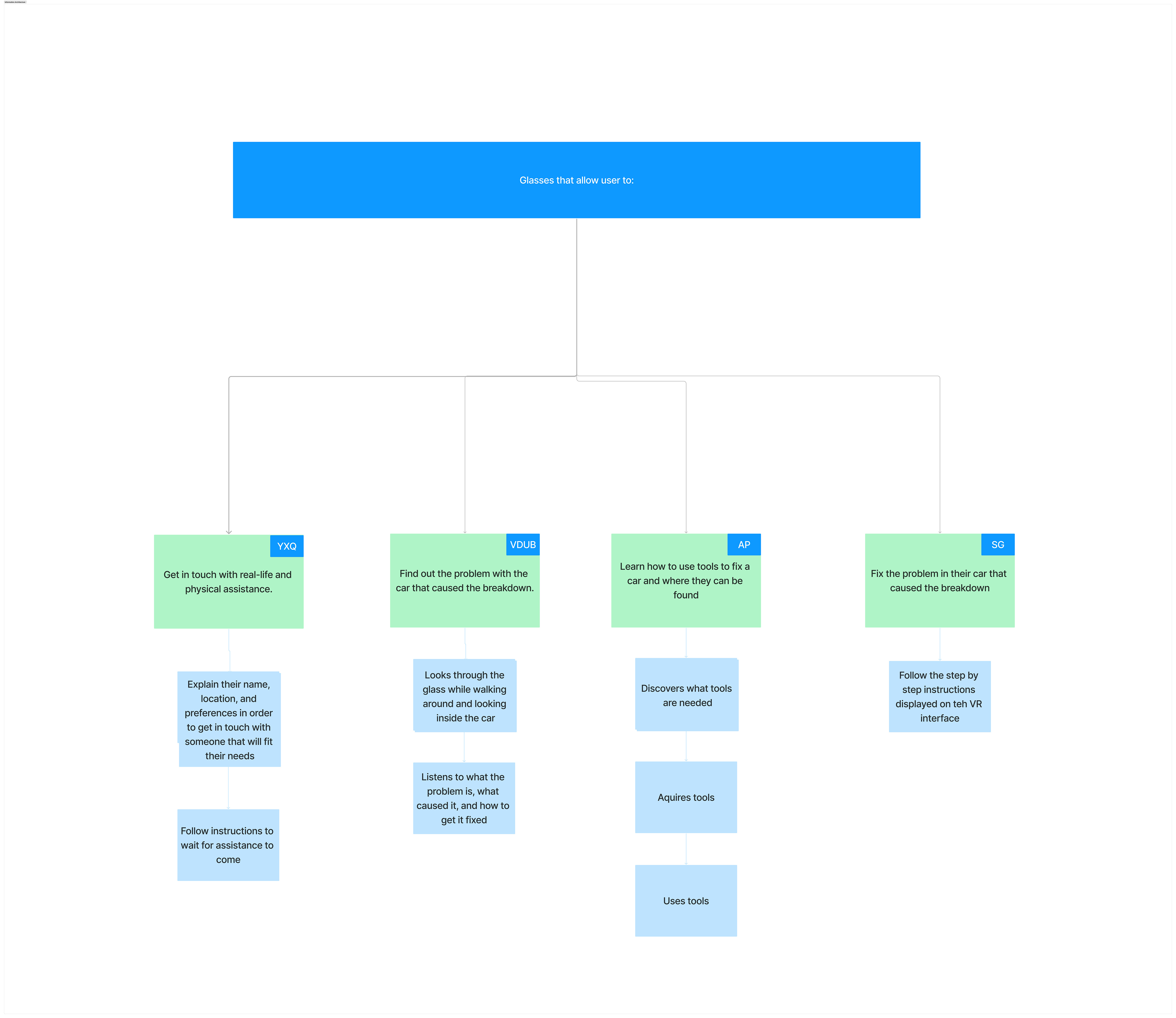
Based on our key goals, we created a general Information Archtitecture to visualize how a
driver might go about addressing the key goals.
General Information Architecture detailing the general goals of our solution.
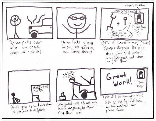
With a general idea on how the flow of our solution would work, we each created a storyboard
based on one of the key goals. Included below is my own storyboard for how a driver might
learn how to use tools to fix a car and where they can be found.
Storyboard demonstrating how users would identify and purchase necessary repair
tools.
Providing proactive resources to promote confidence and learning.
Providing real-time mechanical guidance.
Offering personalized, stress-reducing support.
Prototyping
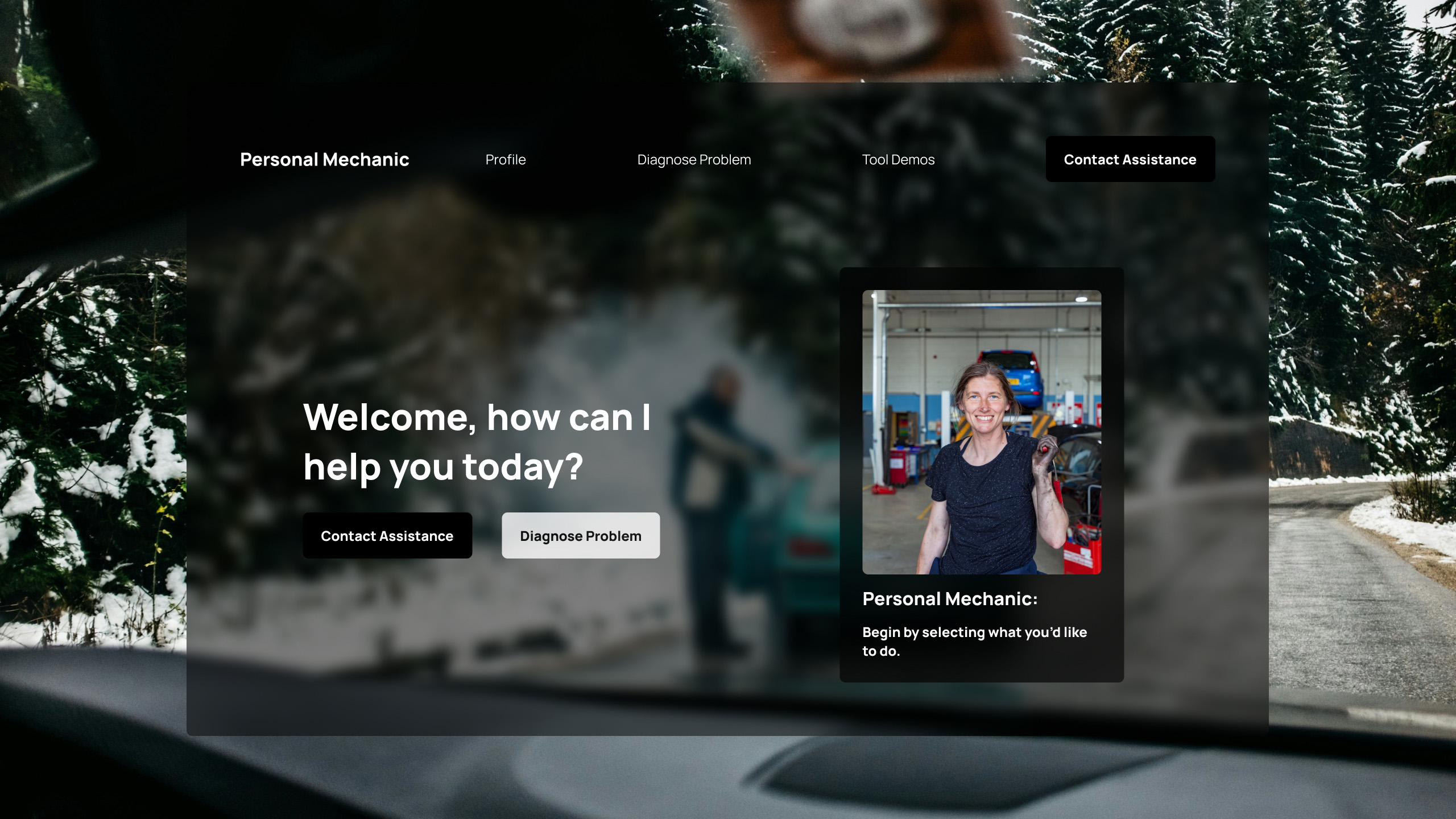
Highlights
Our main prototyping focuses included a virtual assistant, accessible via a dedicated screen
pane, featuring prominent "Contact Assistance" and "Diagnose Problem" buttons.
This simplified interaction flow demonstrates core application features, including conceptual
voice input (simulated for usability testing in this prototype).
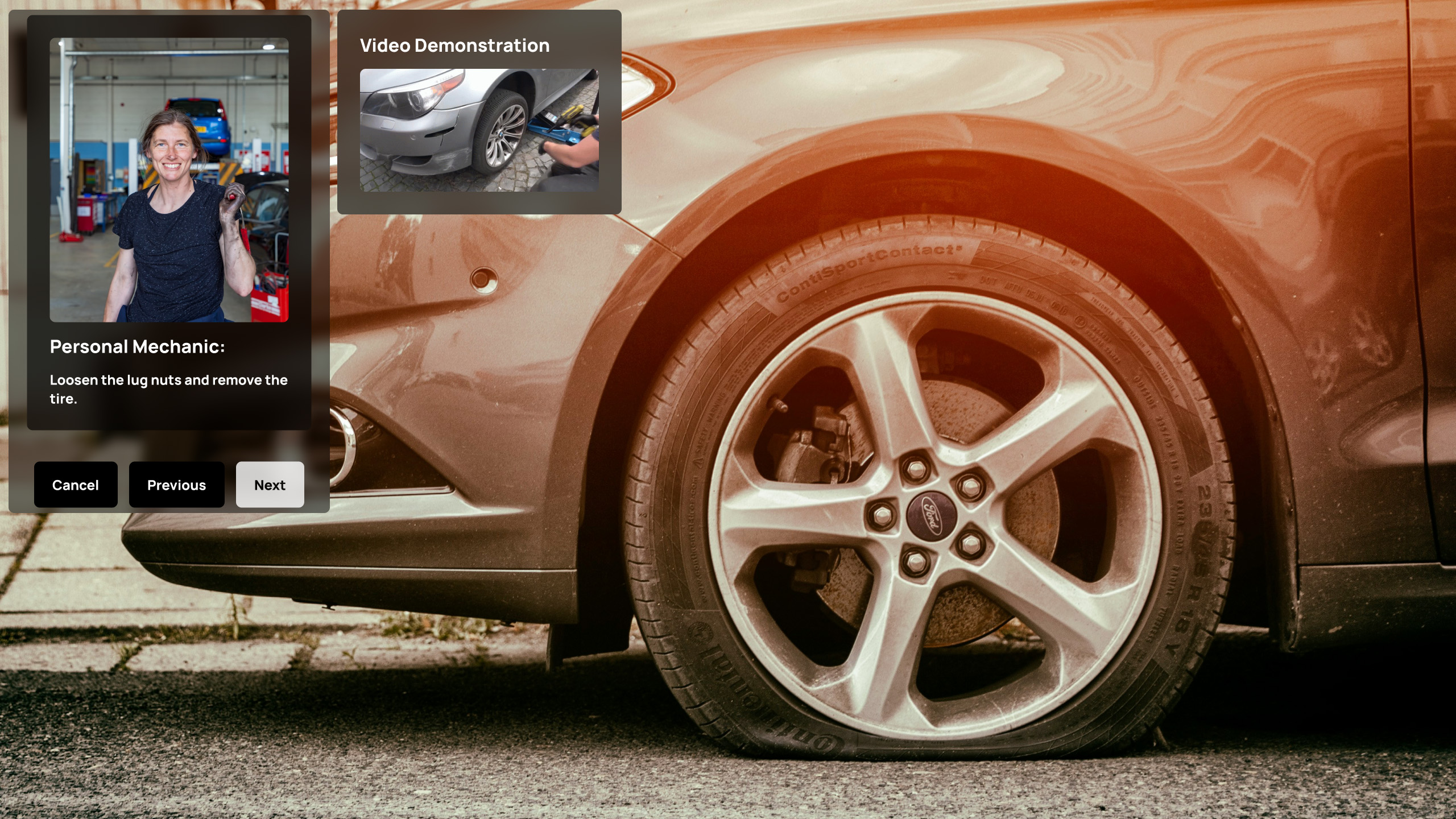
User Experience Considerations
Streamlined prototype focuses on instructional content access.
Intentionally omits complete store selection process to maintain usability.
Provides navigation flexibility with a "Previous" button.
Conceptual voice input simulates commands for usability testing.
Visual Design Approach
"Frosted glass" background effect emphasizes the AR environment, minimizing
distractions and improving real-world visibility.
Employs a minimal color palette of black, white, and subtle gray hues.
Maintains a modern, cohesive look with consistent font styles.
"Contact Assistance" button is always available, ensuring users can readily access
help.
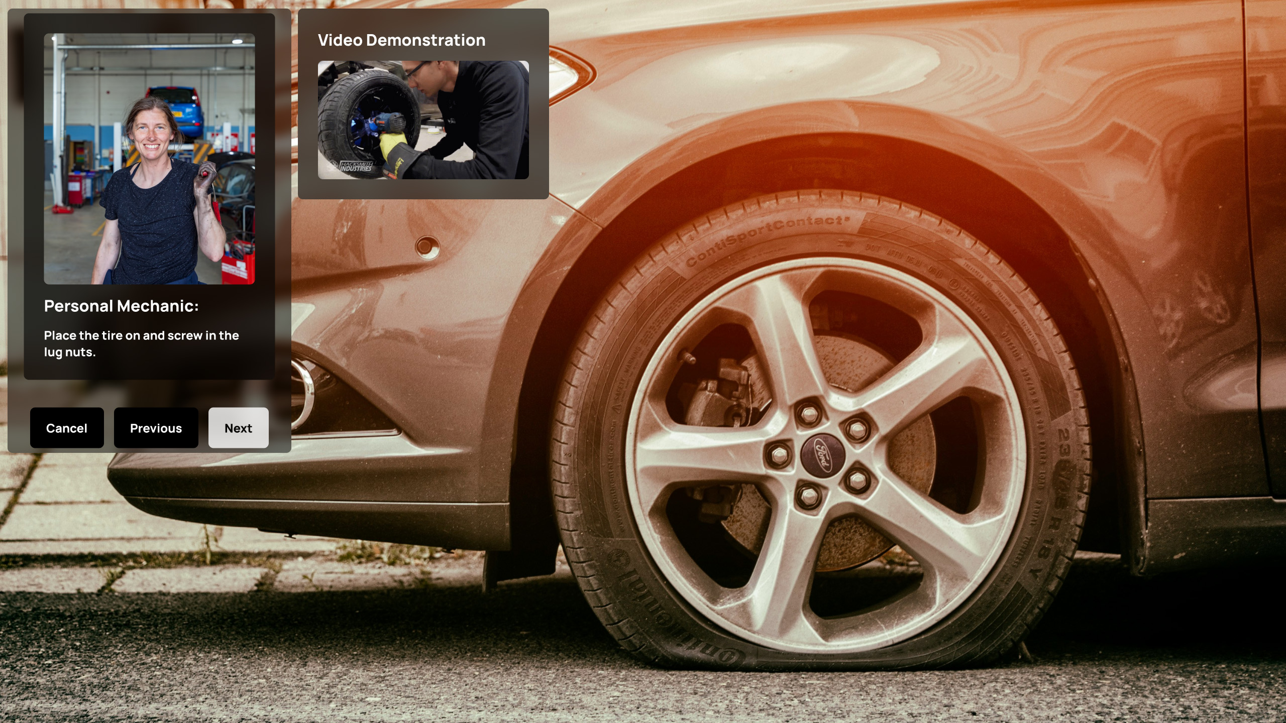
Medium Fidelity Prototype
To refine our design, we began with individual paper prototypes based on our core user tasks.
Each team member conducted usability testing with a target user, gathering valuable feedback on
their respective prototypes.
After analyzing and synthesizing our findings, we developed a more refined, medium-fidelity
prototype using Figma. This iterative approach allowed us to incorporate user insights while
maintaining interface consistency.
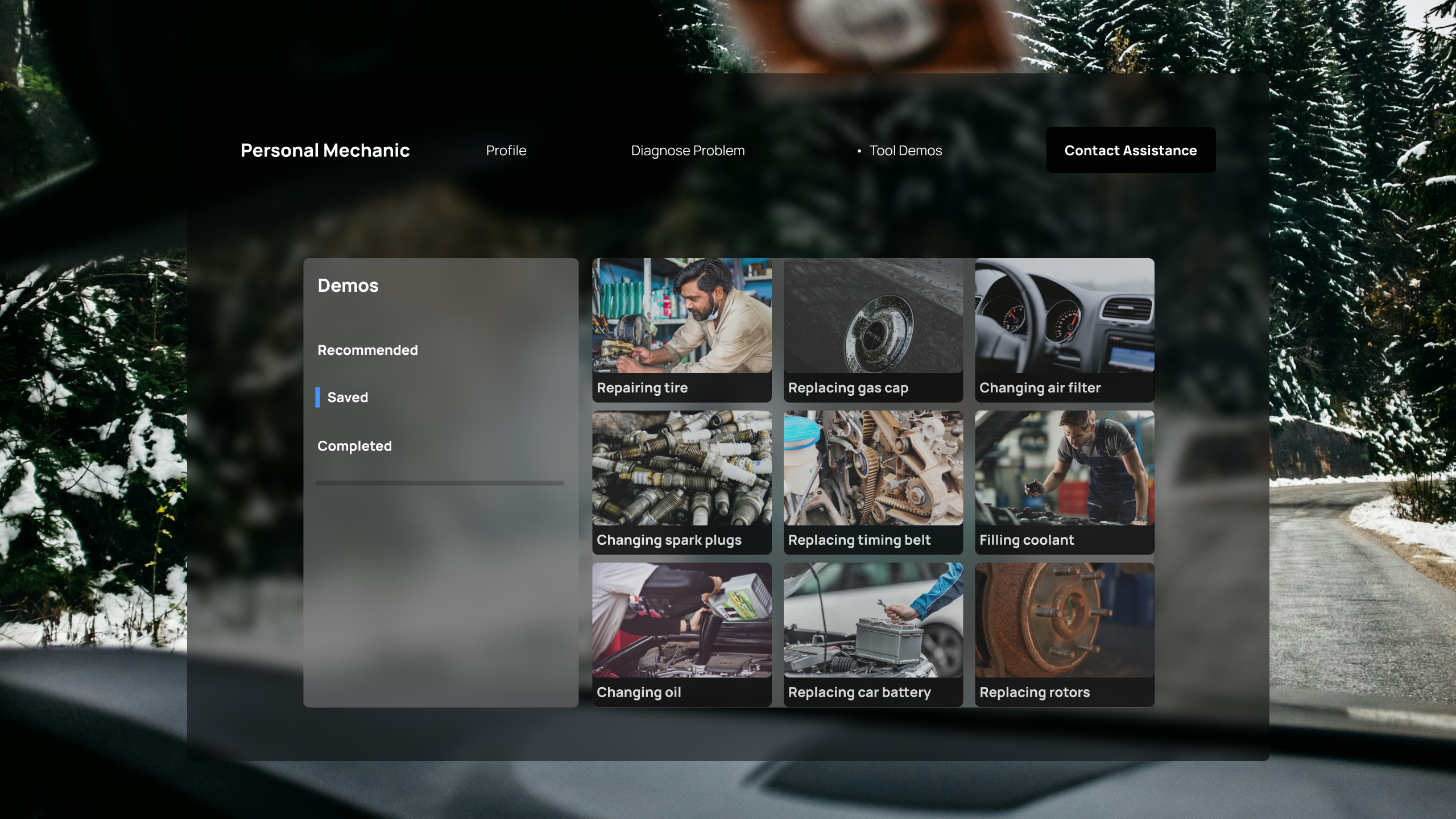
Medium fidelity home screen.Medium fidelity screen used to walk user through repair step.Medium fidelity screen allowing user to use instructional repair tutorials.
Usability Testing
With our prototype, we recruited 4 participants who share similar characteristics of our persona
to conduct usability tests. The questions asked were based on predetermined answers within the
prototype.
Testing Tasks
What is the diagnosis of the vehicle's problem?
What are the options provided for roadside assistance?
What is the current user's name?
How to track the current tow truck location?
What are the steps to fixing a tire?
What is the first saved tool demonstration?
What are the options for buying a tool when repairing the problem?
Follow-up Questions
Product Experience
What did you like about the product?
What was challenging for you when navigating the product?
Where do you think we can make our product better guide our user?
Will you use our product in the future?
Features & Functionality
Where do you think our product might help you the most?
Are there any features you would add to the product?
Are there any features on the product that you do not think are needed?
Design & Audience
What audience do you think would most benefit from our product?
What do you think of the layout of the product?
What do you think about the visual aspect of the product?
Any questions about the product or where we want to go next?
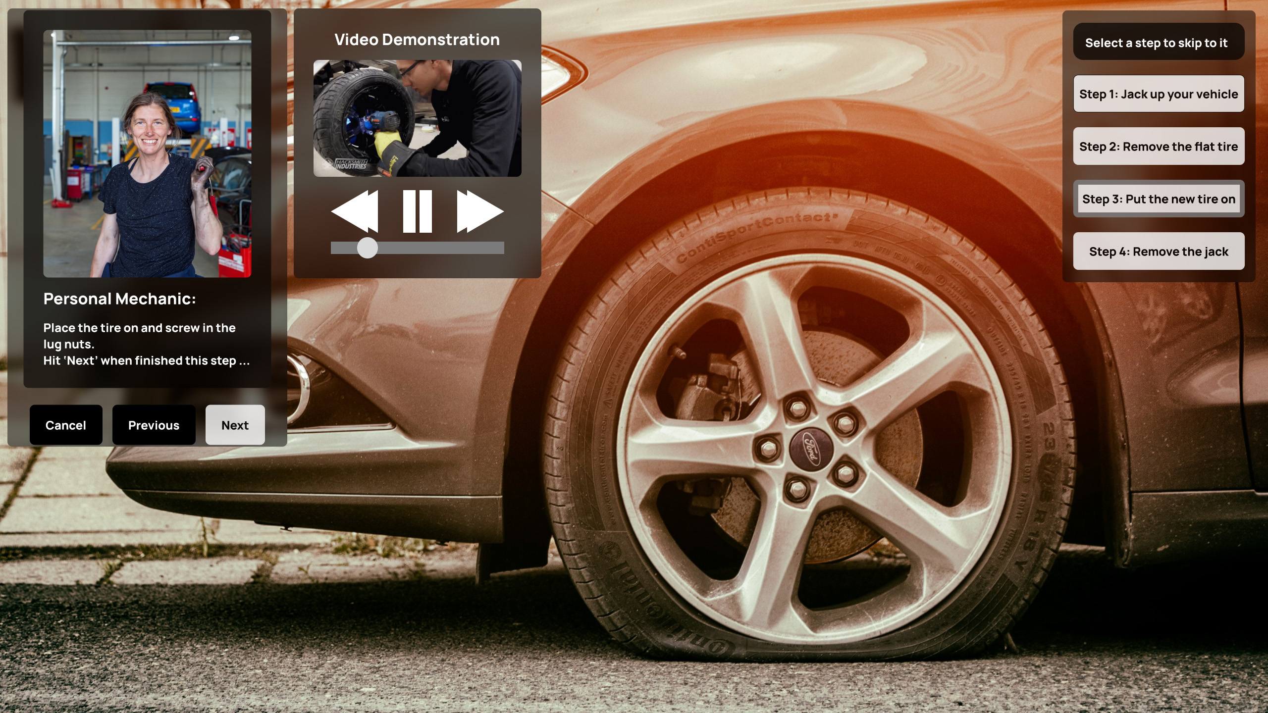
Design Improvements
Alongside our findings in the usability tests, we used Heuristic Evaluation results completed by each
team member to analyze problems our prototype had and whether we could justify the extent of
changes. Here are some of the most important changes:
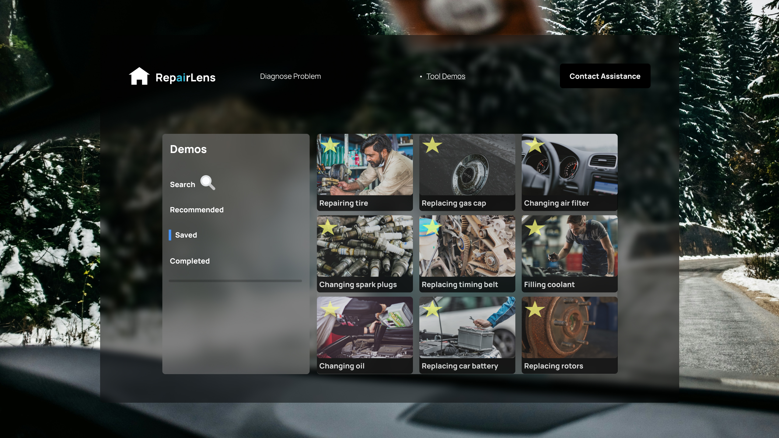
Before
Unclear to users how to save videos. We also found that trying to
find a specific video may use too high memory load.
After
Added stars to the top right of each video which allows the user to
save videos. Additionally, added a search bar functionality
allowing users to quickly find videos.
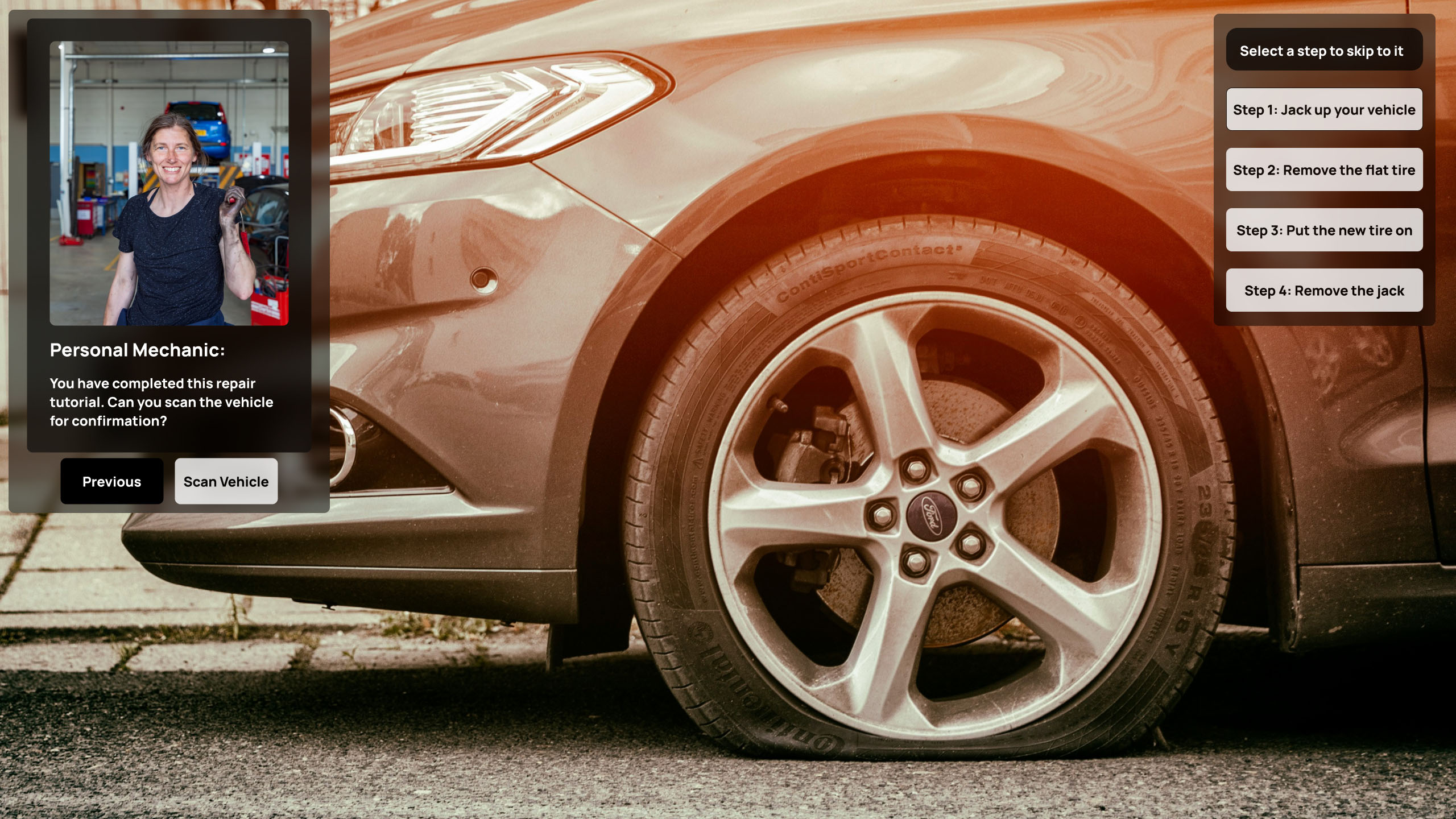
Before
Users were confused by limited "Previous" or "Complete" options
after repairs, violating the Help & Documentation heuristic.
After
Implemented a new workflow that prompts the user to confirm the
repair with help from the application, add confirmation reassuring users they can
seek further assistance, and standardize the repair verification process. This
directly addresses our persona's need for confidence during car repairs by
offering clearer guidance and verification.
Before
Lack of video controls violated "user in control" and "shortcuts for
advanced users" principles.
After
Implemented comprehensive video controls allowing users to revisit
or skip sections as needed. This provides a flexible, user-centric video
instruction experience that respects different learning styles and
expertise levels.
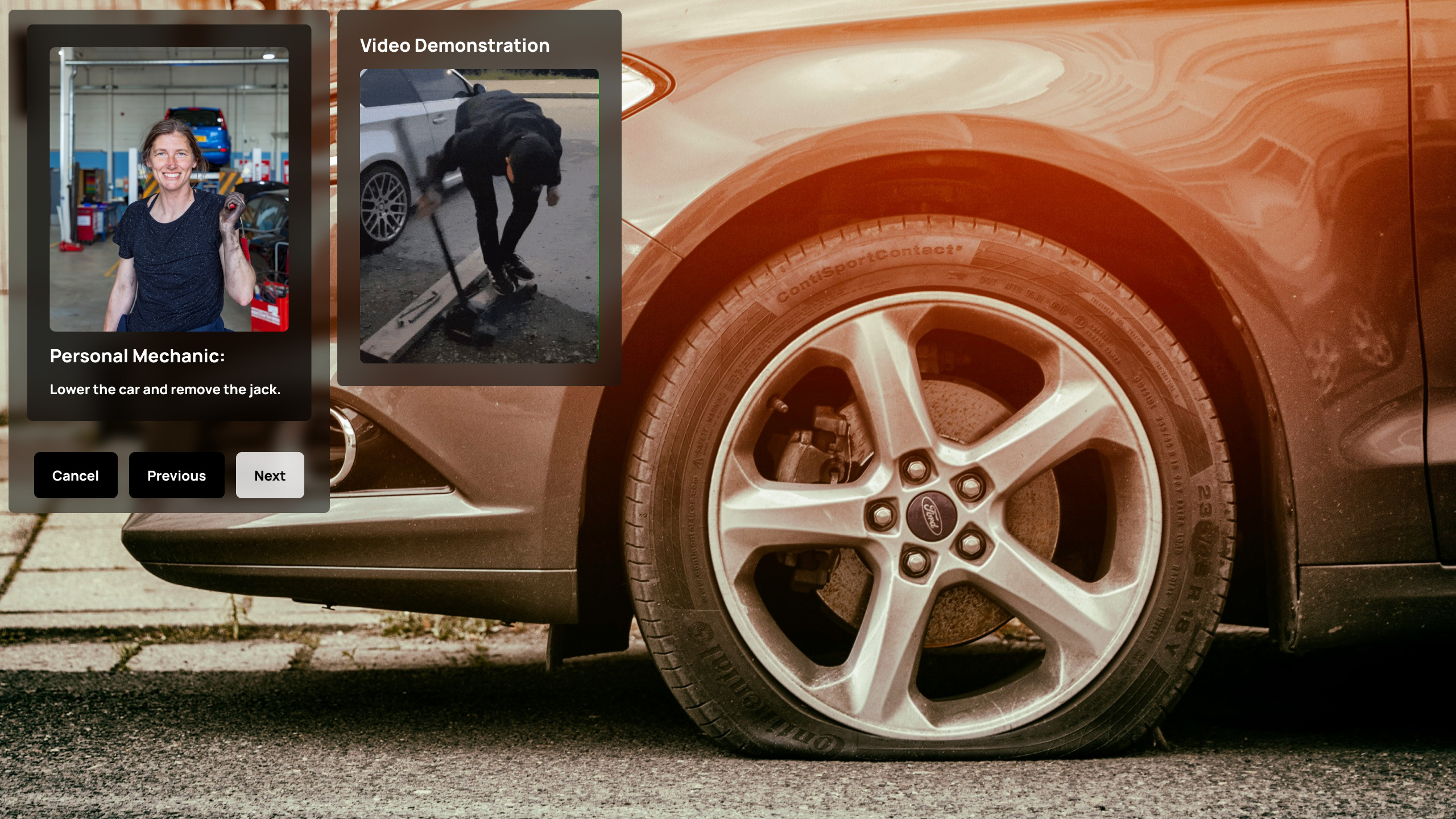
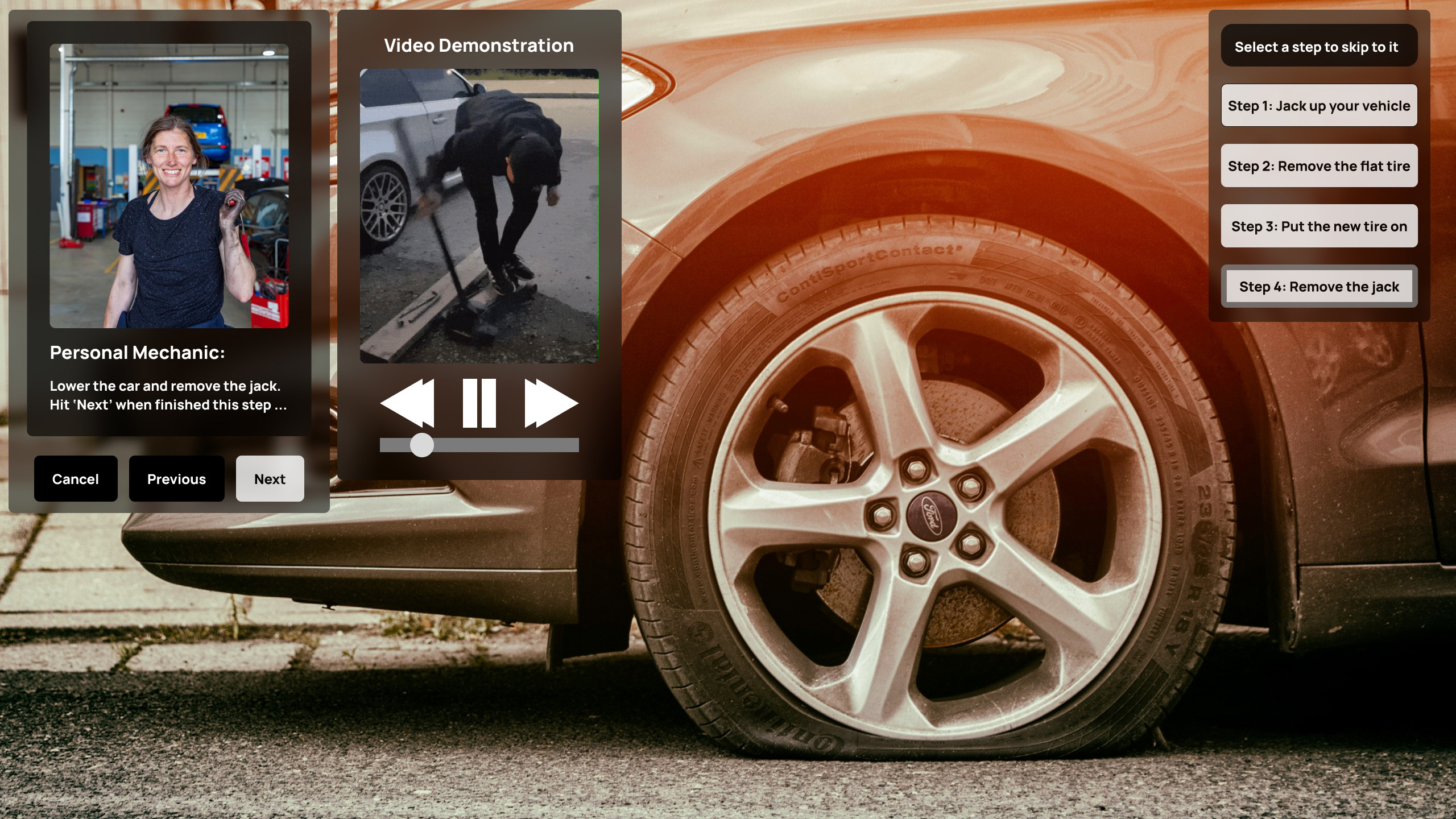
Before
Users were forced to navigate steps sequentially with no option to
skip between repair steps.
After
Added interactive timeline alongside repair instructions allowing
users quick navigation. This significantly improves repair process
flexibility and efficiency by allowing users to easily move between
steps based on their needs and expertise.
Reflection
Key Takeaways:
Importance of Clear System Feedback: This project reinforced the importance of
providing users with clear, timely feedback about system status. The confusion users experienced
during scanning and assistance request processes highlighted the need for more transparent
indicators.
Value of Flexible Navigation: Implementing a timeline feature that allows users
to easily navigate between different sections proved to be a valuable improvement. It
significantly enhanced the user's ability to resume tasks and move freely within the
application.
Balancing Beginner and Expert Users: Finding the right balance to cater to both
beginners and experienced users was challenging but crucial. Adding shortcuts for advanced users
while maintaining comprehensive guidance for others enhanced the overall user experience.
Future Directions:
Apply insights gained to further streamline the error light diagnosis process.
Explore ways to enhance the repair confirmation experience.
Continue to build out the tutorial library functionality, as this has strong potential to
improve the application.