Using iClicker data from a Business Intelligence course, our team developed interactive
dashboards to help both instructors and students understand engagement patterns, identify
learning challenges, and track performance metrics. We built these dashboards in R Shiny to
transform complex data into actionable insights for both audiences.
Duration2 weeks
RoleData Visualization Developer
Team6 members
ToolsR, R Shiny, Figma
My Contributions: I focused on developing the student dashboard,
specifically building the "Comfort with Material" trend visualization and the "Points Earned
in Different Categories" bar chart. Throughout the project, I collaborated with the team to
identify which visualizations would provide the most value, ensuring that our designs
addressed the key questions students and instructors needed answered.
Data
The project utilized two primary datasets from the Business Intelligence course spanning 2016-2018,
providing comprehensive insights into student skills, engagement, and performance.
Experience Dataset
This dataset captures student background and technical proficiency across multiple domains:
One record per student covering 2016–2018 academic years
Self-reported skill assessments in Database, SQL, Programming, ETL, and Data Visualization
De-identified with student_key, year, program designation (GRAD/UGRAD), and skill scores on a
0–5 scale
Missing values possible due to incomplete survey participation
Quiz Dataset
This dataset tracks student engagement and performance throughout each course session:
One record per student per iClicker session
Comprehensive attributes including session date, attendance, quiz number, clicker participation,
quiz scores, and temperature (comfort) scores
Joins to experience dataset via student_key for cross-referenced analysis
Student Dashboard
Target Audience
Students enrolled in the Business Intelligence course (2016–2018) representing a diverse mix of
technical backgrounds and experience levels.
Dashboard Goals
The student dashboard was designed to answer critical questions about individual performance and
positioning within the class:
Provide clear visibility into personal performance relative to class benchmarks
Enable students to identify areas of strength and opportunities for improvement
Answer questions such as: How do my quiz scores compare to class averages? Is my attendance and
participation consistent with my peers? How does my comfort level with material track over time?
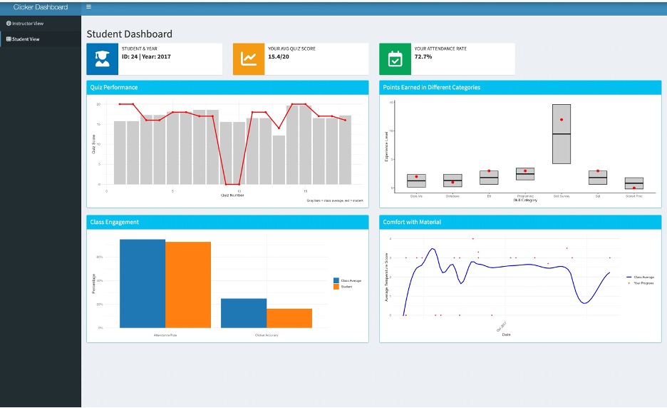
Displayed Metrics
Individual quiz scores (0–20 points) tracked across all course sessions
Clicker participation metrics showing both accuracy and engagement rates
Temperature scores (0–4 scale) illustrating comfort level progression
Personal skill assessment scores (0–4 scale) compared against class averages for each technical
domain
Visualization Design
Each visualization was strategically selected to maximize clarity and actionable insights:
Combined line and bar chart overlaying individual quiz performance against class averages
Comparative bar chart highlighting personal skill assessments relative to class benchmarks
Dual-line graph tracking both individual and class-wide comfort with course material
Engagement bar chart displaying attendance and clicker accuracy alongside class comparisons
Design Process
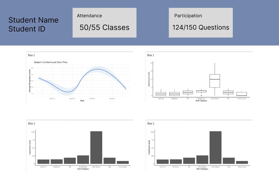
We began with low-fidelity wireframes to establish the dashboard's information hierarchy and layout
structure:
Student dashboard wireframe (Figma sketch).
The final implementation translates these wireframes into a functional, visually refined dashboard:
Student dashboard website render.
Instructor Dashboard
Target Audience
Business Intelligence course instructors requiring comprehensive tools to monitor class performance,
engagement patterns, and student outcomes across multiple years.
Dashboard Goals
The instructor dashboard provides a holistic view of class dynamics and learning patterns:
Track overall class performance and engagement trends across academic years
Identify at-risk students early to enable targeted interventions
Understand relationships between attendance, clicker participation, and academic performance
Analyze question difficulty and student comprehension patterns
Compare current class metrics against historical performance data
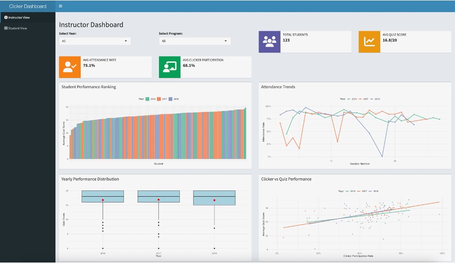
Displayed Metrics
Student performance rankings with cumulative score distributions
Attendance pattern analysis over time
Year-over-year performance distribution comparisons
Clicker participation rates and accuracy metrics
Question difficulty analysis based on completion and correctness rates
Correlation analysis between attendance and academic performance
Historical trend analysis spanning 2016–2018
Visualization Design
Visualizations prioritize actionable insights for instructional decision-making:
Ranked bar chart displaying cumulative student scores for quick identification of performance
outliers
Time-series line plots revealing attendance trends and patterns
Box plots comparing yearly performance distributions to identify cohort differences
Scatter plot correlating clicker participation with quiz performance
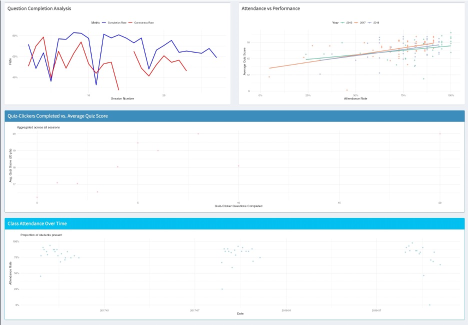
Dual-axis line chart analyzing question completion versus correctness rates
Correlation scatter plot examining attendance impact on academic outcomes
Design Process
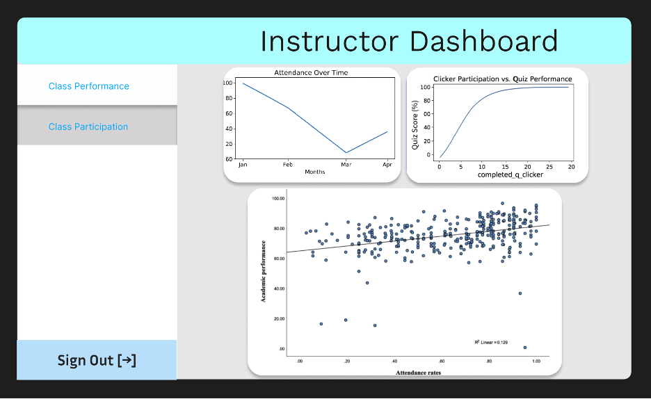
Similar to the student dashboard, we started with wireframes to map out the instructor's information
needs:
Instructor dashboard wireframe (Figma sketch).
The final implementation provides instructors with comprehensive analytics across multiple views:
Instructor dashboard showing performance rankings and attendance trends.Additional instructor dashboard views displaying engagement correlations and historical
comparisons.
Reflection
Student Dashboard
What Worked Well: The dashboard successfully balances clarity with
comprehensive information. The summary boxes at the top provide immediate performance insights,
while the quiz chart's visual design (red line overlaid on gray bars) makes individual standing
immediately apparent. The engagement bar chart effectively presents both attendance and clicker
accuracy in a single, intuitive view.
Future Enhancements: Given more development time, I would implement interactive
hover states to reveal detailed data points and add filtering capabilities allowing students to
benchmark against specific performance thresholds. Additionally, a goal-tracking feature with
personal reflection prompts could enhance the learning experience.
Key Challenge: Maintaining accuracy in class average calculations while
handling missing data presented the most significant technical challenge. We implemented
rigorous validation processes, cross-referencing all calculations against the complete dataset
to ensure data integrity.
Instructor Dashboard
What Worked Well: The instructor dashboard effectively distills complex class
dynamics into actionable insights. The summary statistics provide quick context, while the
performance ranking visualization excels at surfacing patterns and outliers that warrant
attention.
Future Enhancements: Advanced filtering capabilities for course sections or
individual instructors would increase utility for larger courses. Automated alert systems for
identifying at-risk students early would enable proactive interventions. A downloadable report
feature would facilitate data sharing with department stakeholders.
Key Challenge: With countless possible visualizations for educational data,
maintaining focus proved challenging. We prioritized clarity and relevance by continuously
evaluating each visualization against instructor needs, ensuring every element served a clear
pedagogical purpose.